A significant part of my bachelor thesis project consisted of analyzing a telecommunication dataset originating from Shanghai. The dataset included records of data transmissions between a base station and a user device. Every record contained the start and end time of the transmission, a unique user-id and the location of the base station. At the very beginning of this project, I wanted to get a visual impression of this data. So I first created for the entire dataset with the Leaflet.js library a heatmap to see where most of the activity lies:
You could clearly see a concentration in the city center, but since this data was accumulated over 1 month, it was also notable that outside of the city center there was little to no data.
After creating this heatmap, I also wanted to get a feeling for the temporal distribution of the data and divided the data into 1 hour time slots and created this time-lapse heatmap:
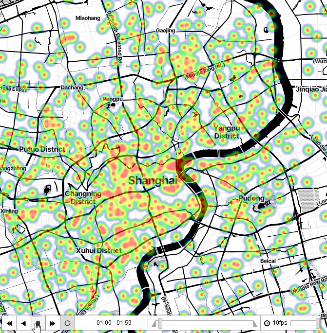
The outcome showed a clear night and day cycle. You can check out the time-lapse heat map here.